Wiki Article Design Guide
From Zenitel Wiki
 |
| Devices used to open ZenitelWiki in 2022 |
In this article, we can find the most commonly used code when making Wiki pages. The code described in this article is responsive, and although it is more complex then what has been used until now, we should try to use this one in future articles.

|
In 2022 16% of the users were using mobile devices. Hence it is important to make the Wiki content suitable for mobile devices. |
Creating a new article
Simply type in the article name in the search field. If it doesn't exist, you are asked to create it:
 |
| Search for the article you want to create |
Article naming: When choosing an article name be concise, keep the title as short as possible while still being descriptive. Avoid unnecessary words. Imaging what people will search for to find this article.
Headings
|
|
|
Use ==Heading 2== for main chapters. Try to use the smaller heading in order to have a good structure.
| Code | How it looks | Alternative code |
| ==Level 2== | Level 2 |
<h2>Level 2</h2> |
| ===Level 3=== | Level 3 |
<h3>Level 3</h3> |
| ====Level 4==== | Level 4 |
<h4>Level 4</h4> |
| =====Level 5===== | Level 5 |
<h5>Level 5</h5> |
| ======Level 6====== | Level 6 |
<h6>Level 6</h6> |
To allow some air between chapter, use <br> to insert extra lines.
Table of Content TOC
- An article with 4 or more headings automatically creates a table of contents
- Use the magic word __NOTOC__ if you don't want a TOC
- Use the magic word __TOC__ if you place the TOC somewhere else than default
Links
Internal links to other Wiki pages
| Code | Result | Additional info |
| [[Getting Started (IC-Edge)]] | Getting Started (IC-Edge) | Used to link to another page in wiki |
| [[:Category:IC-EDGE_System]] | Category:IC-EDGE_System | Used to link to a category in a paragraph |
| [[#Lists]] | #Lists | Used to link to a section on the same page in wiki |
| [[Getting Started (IC-Edge)#Set Directory]] | Getting Started (IC-Edge)#Set Directory | Used to link to a section on another page in wiki |
| 1. [[:Category:IC-EDGE_System|all pages in IC-Edge category]] 2. See the [[#Lists|list explanation]] bellow 3. Check how to configure [[Getting Started (IC-Edge)#Set Directory|directory]] here |
1. all pages in IC-Edge category 2. See the list explanation bellow 3. Check how to configure directory here |
Used to change the display name of the link, can be used with all links above |
| [[Category:Wiki design]] | Used to add category at end of page (result is displayed at end) |
External Links
| Code | Result | Additional info |
| [https://wiki.zenitel.com/wiki/Main_Page Zenitel Wiki] | Zenitel Wiki | Used to link to external page, with description included |
| [https://wiki.zenitel.com/wiki/Main_Page] | [1] | This is what happens if you omit the link text. Multiple links of this type on the same page are numbered sequentially. |
| https://wiki.zenitel.com/wiki/Main_Page | https://wiki.zenitel.com/wiki/Main_Page | URLs beginning with "http://" and "https://" are automatically linked, even when no brackets are used. Use tag to avoid automatic linking |
Lists
When using a short list with not a lot of content the normal list is OK to use. When having images or other content that needs to be listed using the following list code will allow continuing the numbering.
The lists can be customized with different fonts and different numbering/bullets. For more info see How to customize lists
Ordered lists
Lists with little information
For lists that don't have a lot of information in the code below can be used. Please note the numbering can be broken if adding an image or a break in the list.
#Example 1
#Example 2
##Example 2.1
#Example 3
#*Example 3.1
|
- Example 1
- Example 2
- Example 2.1
- Example 3
- Example 3.1
Lists with more infomation
- Example 1
- Example 2
- Example 2.1
-
- Example 3

Code for the example above:
<ol>
<li>Example 1</li>
<li>Example 2
<ol>
<li>Example 2.1</li>
</ol>
</li>
<li>
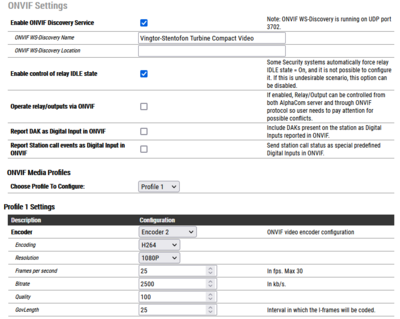
[[Image:Onvif1.png|left|400px]] <br clear=all/>
</li>
<li> Example 3</li>
</ol>
|
Unordered list (bullet points)
Lists with little information
For lists that don't have a lot of information in the code below can be used. Please note the list structure can be broken if adding an image or a break in the list.
#Example 1
*Example 2
**Example 2.1
*Example 3
*#Example 3.1
|
- Example 1
- Example 2
- Example 2.1
- Example 3
- Example 3.1
Lists with more infomation
- Example 1
- Example 2
- Example 2.1
-
- Example 3
Code for the example above:
<ul>
	<li>Example 1</li>

	<li>Example 2
		<ul>
			<li>Example 2.1</li>
		</ul>
	</li>

	<li>
         [[Image:Onvif1.png|left|400px]] <br clear=all/>
        </li>

	<li> Example 3</li>
</ul>
|
Adding a responsive table
This is an example of a table that is responsive, changes size based on screen size
Table that fills out whole page
| Example 1 | Example 2 | Example 3 |
| Example 4 | Example 5 | Example 6 |
| Example 7 | Example 8 | Example 9 |
Code for the example table above.
<table style='width:100%;'>
  <tr style='background-color:#ffd400'>
    <td style='border:1px solid; font-weight:bold'>Example 1</td>
    <td style='border:1px solid; text-align:center;font-weight:bold'>Example 2</td>
    <td style='border:1px solid;text-align:right;font-weight:bold'>Example 3</td>
  </tr>
  <tr>
    <td style='border:1px solid'>Example 4</td>
    <td style='border:1px solid; text-align:center;'>Example 5</td>
    <td style='border:1px solid;text-align:right;'>Example 6</td>
  </tr>
<tr>
    <td style='border:1px solid'>Example 7</td>
    <td style='border:1px solid; text-align:center;'>Example 8</td>
    <td style='border:1px solid;text-align:right;'>Example 9</td>
  </tr>
</table>
|
Table that fills part of the page
It is also possible the adjust the width of the table if there is no need to be extended on the whole screen.
This is an example of a table which will only take 60% of the screen size.
| Example 1 | Example 2 | Example 3 |
| Example 4 | Example 5 | Example 6 |
| Example 7 | Example 8 | Example 9 |
Code for the example table above:
<table style='width:60%;'>
  <tr>
    <td style='border:1px solid;background-color:#ffd400; font-weight:bold'>Example 1</td>
    <td style='border:1px solid'>Example 2</td>
    <td style='border:1px solid'>Example 3</td>
  </tr>
  <tr style="text-align:right;">
    <td style='border:1px solid;background-color:#ffd400; font-weight:bold'>Example 4</td>
    <td style='border:1px solid'>Example 5</td>
    <td style='border:1px solid'>Example 6</td>
  </tr>
<tr>
    <td style='border:1px solid;background-color:#ffd400; font-weight:bold'>Example 7</td>
    <td style='border:1px solid'>Example 8</td>
    <td style='border:1px solid'>Example 9</td>
  </tr>
</table>
|
Table with different column width
This is a example of a table with different column width and fills only 70% of the screen. This two attributes can be used together.
| Example 1 | Example 2 | Example 3 |
| Example 4 | Example 5 | Example 6 |
| Example 7 | Example 8 | Example 9 |
Code for the example table above:
<table style='width:70%;'>
  <tr>
    <td style='border:1px solid;background-color:#ffd400; font-weight:bold; width=40%'>Example 1</td>
    <td style='border:1px solid; width:25%;'>Example 2</td>
    <td style='border:1px solid; width:5%;'>Example 3</td>
  </tr>
  <tr style="text-align:right;">
    <td style='border:1px solid;background-color:#ffd400; font-weight:bold; width:40%;'>Example 4</td>
    <td style='border:1px solid; width:25%;'>Example 5</td>
    <td style='border:1px solid; width:5%;'>Example 6</td>
  </tr>
<tr>
    <td style='border:1px solid;background-color:#ffd400; font-weight:bold; width:40%;'>Example 7</td>
    <td style='border:1px solid; width:25%;'>Example 8</td>
    <td style='border:1px solid; width:5%;'>Example 9</td>
  </tr>
</table>
|
Adding a responsive image
For screen shots we often use the size 700px, left oriented, but of course this needs to be considered case by case.
Image without description under image
If an image is used without a description on the bottom, the default code should be used to add the image, without thumb.
[[Image:Edge MainSettings2.PNG|left|700px]]
|
Example when aligned to left

[[File:Edge MainSettings2.PNG|right|700px]]
|
Image with description under image
When needed description under the image, the thumb attribute makes the image not responsive when viewing on smaller screens. In that case, a different code can be used to make the image responsive. The code is a table with the image in it.
<table style="max-width:80%; border-style: double; border-color: #c7c7c7;">
<tr style="rowspan:2;">
<td style="display: block; vertical-align: bottom;">[[Image:Edge MainSettings2.PNG|700px]]</td>
</tr>
<tr>
<td style='background-color:#efefef;'>Setting the Edge Controller</td>
</tr>
</table>
|
|
| Setting the Edge Controller |
To have an image to the right with a description, use the following code.
<table style="float:right; max-width:80%; border-style: double; border-color: #c7c7c7;">
<tr style="rowspan:2;">
<td style="display: block; vertical-align: bottom;">[[Image:Edge MainSettings2.PNG|700px]]</td>
</tr>
<tr>
<td style='background-color:#efefef;'>Setting the Edge Controller</td>
</tr>
</table>
|
|
| Setting the Edge Controller |
Events
Example on how events should be displayed. An image showing the event, followed by a list of the commands used.
The image should be thumb to the left with 500px.

- Actions - using template code2
{{Code2|
 Line 1
 Line 2
 Line 3
}}
Result
Action commands:
Line 1
Line 2
Line 3
Issue when using equal (=) inside code is resolved by adding nowiki and /nowiki at marked position (X):
{{Code2|
 IF %op(%sev,X==X,231)
 IND %1.phy %1.dak(I%2.dir) 1 1
 $DTS L%1.dir 'Select cell' U1}}
Result
Action commands:
Line 1 ==
Line 2
Line 3
Templates
Note template
Example 1:
{{Note|Lorem ipsum dolor sit amet, consetetur sadipscing elitr, sed. }}
Result:
|
|
Lorem ipsum dolor sit amet, consetetur sadipscing elitr, sed. |
Example 2:
{{Note|Lorem ipsum dolor sit amet, consetetur sadipscing elitr, sed diam nonumy eirmod tempor invidunt ut labore et dolore magna aliquyam erat, sed diam voluptua. At vero eos et accusam et justo duo dolores et ea rebum. Stet clita kasd gubergren, no sea takimata sanctus est Lorem ipsum dolor sit amet. Lorem ipsum dolor sit amet, consetetur sadipscing elitr, sed diam nonumy eirmod tempor invidunt ut labore et dolore magna aliquyam erat, sed diam voluptua. At vero eos et accusam et justo duo dolores et ea rebum. Stet clita kasd gubergren, no sea takimata sanctus est Lorem ipsum dolor sit amet. Lorem ipsum dolor sit amet, consetetur sadipscing elitr, sed diam nonumy eirmod tempor invidunt ut labore et dolore magna aliquyam erat, sed diam voluptua. At vero eos et accusam et justo duo dolores et ea rebum. Stet clita kasd gubergren, no sea takimata sanctus est Lorem ipsum dolor sit amet. }}
Result:
|
|
Lorem ipsum dolor sit amet, consetetur sadipscing elitr, sed diam nonumy eirmod tempor invidunt ut labore et dolore magna aliquyam erat, sed diam voluptua. At vero eos et accusam et justo duo dolores et ea rebum. Stet clita kasd gubergren, no sea takimata sanctus est Lorem ipsum dolor sit amet. Lorem ipsum dolor sit amet, consetetur sadipscing elitr, sed diam nonumy eirmod tempor invidunt ut labore et dolore magna aliquyam erat, sed diam voluptua. At vero eos et accusam et justo duo dolores et ea rebum. Stet clita kasd gubergren, no sea takimata sanctus est Lorem ipsum dolor sit amet. Lorem ipsum dolor sit amet, consetetur sadipscing elitr, sed diam nonumy eirmod tempor invidunt ut labore et dolore magna aliquyam erat, sed diam voluptua. At vero eos et accusam et justo duo dolores et ea rebum. Stet clita kasd gubergren, no sea takimata sanctus est Lorem ipsum dolor sit amet. |
Example 3:
{{Note|
* Lorem ipsum dolor sit amet, consetetur sadipscing elitr, sed diam nonumy e
* '''Stet clita kasd gubergren, no sea takimata sanctus est Lorem ipsum dolor sit amet. Lorem ipsum dolor sit amet, consetetur sadipscing elitr'''
* ''Duis autem vel eum iriure dolor in hendrerit in vulputate velit esse molestie consequat'' }}
Result:
|
|
|
Warning template
Example code:
{{Warn|Lorem ipsum dolor sit amet, consetetur sadipscing elitr, sed. }}
Result:

|
Lorem ipsum dolor sit amet, consetetur sadipscing elitr, sed. |
Observe template
Example code:
{{Obs|Lorem ipsum dolor sit amet, consetetur sadipscing elitr, sed. }}
Result:

|
Lorem ipsum dolor sit amet, consetetur sadipscing elitr, sed. |
Obsolete template
Example code:
{{Obsolete }}
Result:

|
This product has been discontinued! |
Under Construction template
Example code:
{{Cons}}
Result:

|
This article is under construction! |
Code template
|
|
If there are operators like = and + inside the code, you need to put nowiki /nowiki commands before and after Example: <nowiki>=</nowiki> |
Example code 1:
{{Code|tst -s /tmp/sipd_trace }}
Result:
tst -s /tmp/sipd_trace
|
Example code 2:
{{Code2|.ex_profile.flags.gcdi_conn_report }}
Result:
Action commands:
.ex_profile.flags.gcdi_conn_report
Example code 3:
{{Code3|.ex_profile.flags.gcdi_conn_report }}
Result:
.ex_profile.flags.gcdi_conn_report
Doc template
Example code 1:
{{Doc|This article is linked to with a static link from the document A100K11920 }}
Result:
|
This article is linked to from the document A100K11920 |